12 Local-diagnostics Plots
12.1 Introduction
It may happen that, despite the fact that the predictive performance of a model is satisfactory overall, the model’s predictions for some observations are drastically worse. In such a situation it is often said that “the model does not cover well some areas of the input space”.
For example, a model fitted to the data for “typical” patients in a certain hospital may not perform well for patients from another hospital with possible different characteristics. Or, a model developed to evaluate the risk of spring-holiday consumer-loans may not perform well in the case of autumn-loans for Christmas-holiday gifts.
For this reason, in case of important decisions, it is worthwhile to check how does the model behave locally for observations similar to the instance of interest.
In this chapter, we present two local-diagnostics techniques that address this issue. The first one are local-fidelity plots that evaluate the local predictive performance of the model around the observation of interest. The second one are local-stability plots that assess the (local) stability of predictions around the observation of interest.
12.2 Intuition
Assume that, for the observation of interest, we have identified a set of observations from the training data with similar characteristics. We will call these similar observations “neighbours”. The basic idea behind local-fidelity plots is to compare the distribution of residuals (i.e., differences between the observed and predicted value of the dependent variable; see equation (2.1)) for the neighbours with the distribution of residuals for the entire training dataset.
Figure 12.1 presents histograms of residuals for the entire dataset and for a selected set of 25 neighbours for an instance of interest for the random forest model for the apartment-prices dataset (Section 4.5.2). The distribution of residuals for the entire dataset is rather symmetric and centred around 0, suggesting a reasonable overall performance of the model. On the other hand, the residuals for the selected neighbours are centred around the value of 500. This suggests that, for the apartments similar to the one of interest, the model is biased towards values smaller than the observed ones (residuals are positive, so, on average, the observed value of the dependent variable is larger than the predicted value).
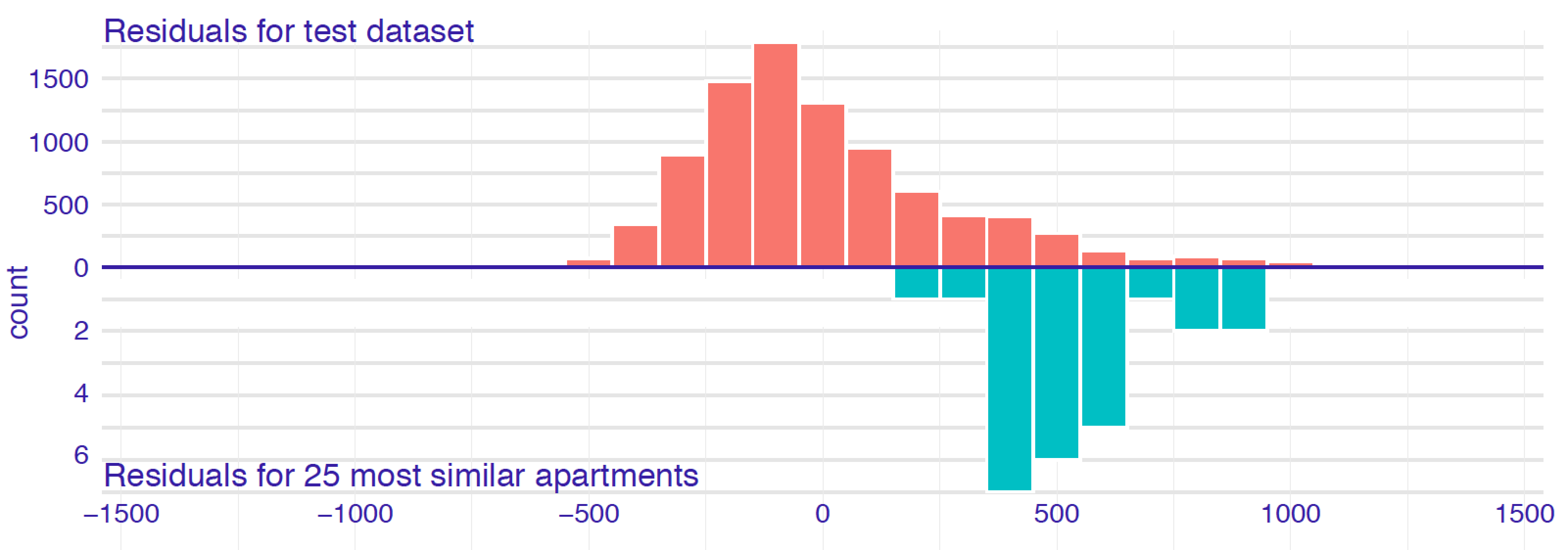
Figure 12.1: Histograms of residuals for the random forest model apartments_rf for the apartment-prices dataset. Upper panel: residuals calculated for all observations from the dataset. Bottom panel: residuals calculated for 25 nearest neighbours of the instance of interest.
The idea behind local-stability plots is to check whether small changes in the explanatory variables, as represented by the changes within the set of neighbours, have got much influence on the predictions. Figure 12.2 presents CP profiles for variable age for an instance of interest and its 10 nearest neighbours for the random forest model for the Titanic dataset (Section 4.2.2). The profiles are almost parallel and very close to each other. In fact, some of them overlap so that only 5 different ones are visible. This suggests that the model’s predictions are stable around the instance of interest. Of course, CP profiles for different explanatory variables may be very different, so a natural question is: which variables should we examine? The obvious choice is to focus on the variables that are the most important according to a variable-importance measure such as the ones discussed in Chapters 6, 8, 9, or 11.
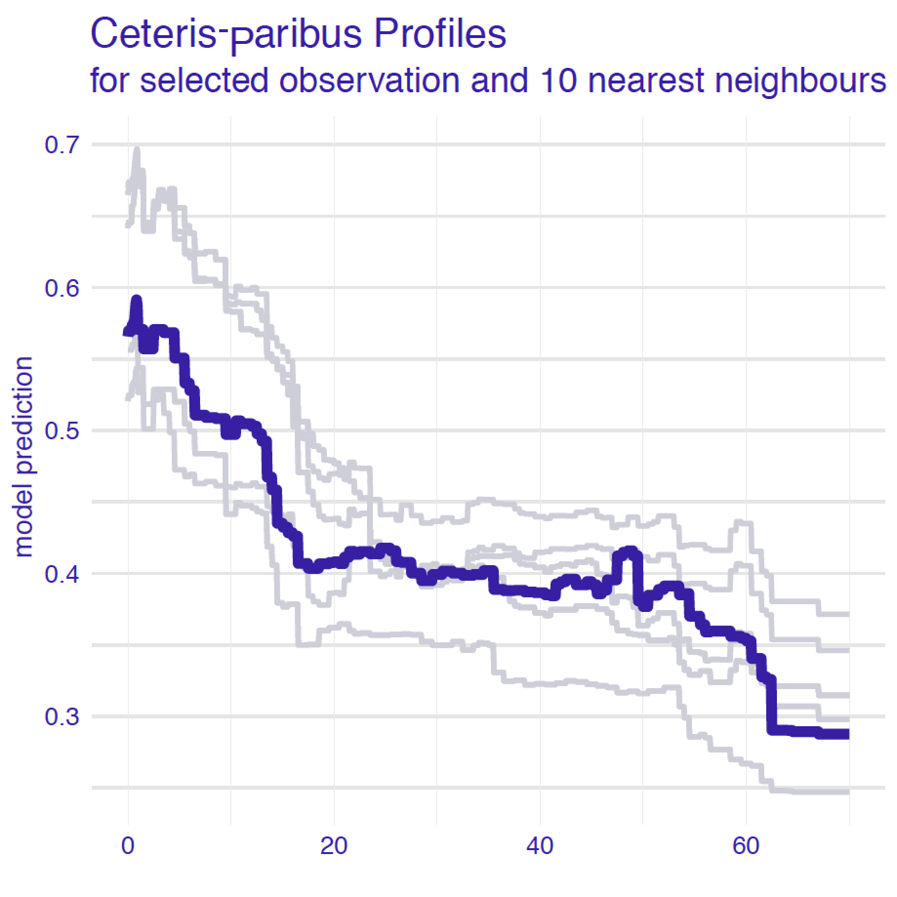
Figure 12.2: Ceteris-paribus profiles for a selected instance (dark violet line) and 10 nearest neighbours (light grey lines) for the random forest model for the Titanic data.
12.3 Method
To construct local-fidelity or local-stability plots, we have got to, first, select “neighbours” of the observation of interest. Then, for the fidelity analysis, we have got to calculate and compare residuals for the neighbours. For the stability analysis, we have got to calculate and visualize CP profiles for the neighbours.
In what follows, we discuss each of these steps in more detail.
12.3.1 Nearest neighbours
There are two important questions related to the selection of the neighbours “nearest” to the instance (observation) of interest:
- How many neighbours should we choose?
- What metric should be used to measure the “proximity” of observations?
The answer to both questions is it depends.
The smaller the number of neighbours, the more local is the analysis. However, selecting a very small number will lead to a larger variability of the results. In many cases we found that having about 20 neighbours works fine. However, one should always take into account computational time (because a smaller number of neighbours will result in faster calculations) and the size of the dataset (because, for a small dataset, a smaller set of neighbours may be preferred). The metric is very important. The more explanatory variables, the more important is the choice. In particular, the metric should be capable of accommodating variables of different nature (categorical, continuous). Our default choice is the Gower similarity measure:
\[\begin{equation} d_{gower}(\underline{x}_i, \underline{x}_j) = \frac{1}{p} \sum_{k=1}^p d^k(x_i^k, x_j^k), \tag{12.1} \end{equation}\]
where \(\underline{x}_i\) is a \(p\)-dimensional vector of values of explanatory variables for the \(i\)-th observation and \(d^k(x_i^k,x_j^k)\) is the distance between the values of the \(k\)-th variable for the \(i\)-th and \(j\)-th observations. Note that \(p\) may be equal to the number of all explanatory variables included in the model, or only a subset of them. Metric \(d^k()\) in (12.1) depends on the nature of the variable. For a continuous variable, it is equal to
\[ d^k(x_i^k, x_j^k)=\frac{|x_i^k-x_j^k|}{\max(x_1^k,\ldots,x_n^k)-\min(x_1^k,\ldots,x_n^k)}, \]
i.e., the absolute difference scaled by the observed range of the variable. On the other hand, for a categorical variable,
\[ d^k(x_i^k, x_j^k)=1_{x_i^k = x_j^k}, \]
where \(1_A\) is the indicator function for condition \(A\).
An advantage of the Gower similarity measure is that it can be used for vectors with both categorical and continuous variables. A disadvantage is that it takes into account neither correlation between variables nor variable importance. For a high-dimensional setting, an interesting alternative is the proximity measure used in random forests (Leo Breiman 2001a), as it takes into account variable importance; however, it requires a fitted random forest model.
Once we have decided on the number of neighbours, we can use the chosen metric to select the required number of observations “closest” to the one of interest.
12.3.2 Local-fidelity plot
Figure 12.1 summarizes two distributions of residuals, i.e., residuals for the neighbours of the observation of interest and residuals for the entire training dataset except for neighbours.
For a typical observation, these two distributions shall be similar. An alarming situation is if the residuals for the neighbours are shifted towards positive or negative values.
Apart from visual examination, we may use statistical tests to compare the two distributions. If we do not want to assume any particular parametric form of the distributions (like, e.g., normal), we may choose non-parametric tests like the Wilcoxon test or the Kolmogorov-Smirnov test. For statistical tests, it is important that the two sets are disjointed.
12.3.3 Local-stability plot
Once neighbours of the observation of interest have been identified, we can graphically compare CP profiles for selected (or all) explanatory variables.
For a model with a large number of variables, we may end up with a large number of plots. In such a case, a better strategy is to focus only on a few most important variables, selected by using a variable-importance measure (see, for example, Chapter 11).
CP profiles are helpful to assess model stability. In addition, we can enhance the plot by adding residuals to them to allow evaluation of the local model-fit. The plot that includes CP profiles for the nearest neighbours and the corresponding residuals is called a local-stability plot.
12.4 Example: Titanic
As an example, we will consider the prediction for Johnny D (see Section 4.2.5) for the random forest model for the Titanic data (see Section 4.2.2).
Figure 12.3 presents a detailed explanation of the elements of a local-stability plot for age, a continuous explanatory variable. The plot includes eight nearest neighbours of Johnny D (see Section 4.2.5). The green line shows the CP profile for the instance of interest. Profiles of the nearest neighbours are marked with grey lines. The vertical intervals correspond to residuals; the shorter the interval, the smaller the residual and the more accurate prediction of the model. Blue intervals correspond to positive residuals, red intervals to negative residuals. For an additive model, CP profiles will be approximately parallel. For a model with stable predictions, the profiles should be close to each other. This is not the case of Figure 12.3, in which profiles are quite apart from each other. Thus, the plot suggests potential instability of the model’s predictions. Note that there are positive and negative residuals included in the plot. This indicates that, on average, the instance prediction itself should not be biased.
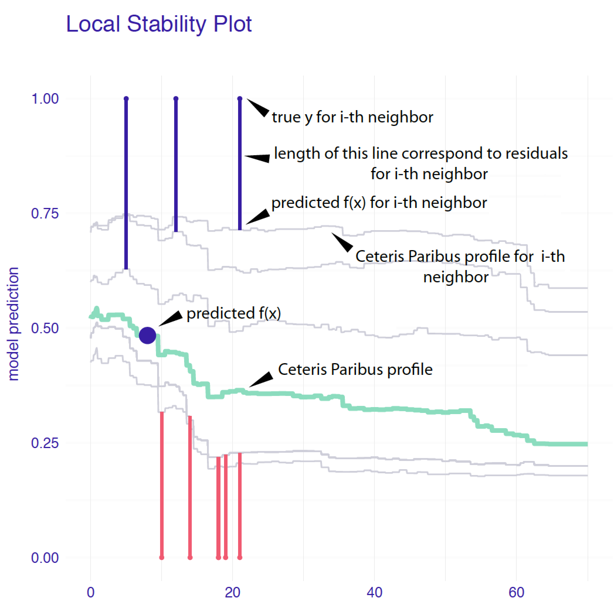
Figure 12.3: Elements of a local-stability plot for a continuous explanatory variable. Ceteris-paribus profiles for variable age for Johnny D and 5 nearest neighbours for the random forest model for the Titanic data.
12.5 Pros and cons
Local-stability plots may be very helpful to check if the model is locally additive, as for such models the CP profiles should be parallel. Also, the plots can allow assessment whether the model is locally stable, as in that case, the CP profiles should be close to each other. Local-fidelity plots are useful in checking whether the model-fit for the instance of interest is unbiased, as in that case the residuals should be small and their distribution should be symmetric around 0.
The disadvantage of both types of plots is that they are quite complex and lack objective measures of the quality of the model-fit. Thus, they are mainly suitable for exploratory analysis.
12.6 Code snippets for R
In this section, we present local diagnostic plots as implemented in the DALEX package for R.
For illustration, we use the random forest model titanic_rf (Section 4.2.2). The model was developed to predict the probability of survival after sinking of Titanic. Instance-level explanations are calculated for Henry, a 47-year-old male passenger that travelled in the first class (see Section 4.2.5).
We first retrieve the titanic_rf model-object and the data frame for Henry via the archivist hooks, as listed in Section 4.2.7. We also retrieve the version of the titanic data with imputed missing values.
titanic_imputed <- archivist::aread("pbiecek/models/27e5c")
titanic_rf <- archivist:: aread("pbiecek/models/4e0fc")
henry <- archivist::aread("pbiecek/models/a6538")
## class gender age sibsp parch fare embarked
## 1 1st male 47 0 0 25 CherbourgThen we construct the explainer for the model by using function explain() from the DALEX package (see Section 4.2.6). We also load the randomForest package, as the model was fitted by using function randomForest() from this package (see Section 4.2.2) and it is important to have the corresponding predict() function available. The model’s prediction for Henry is obtained with the help of that function.
library("randomForest")
library("DALEX")
explain_rf <- DALEX::explain(model = titanic_rf,
                          data = titanic_imputed[, -9],
                             y = titanic_imputed$survived == "yes",
                         label = "Random Forest")
predict(explain_rf, henry)
## [1] 0.246To construct a local-fidelity plot similar to the one shown Figure 12.1, we can use the predict_diagnostics() function from the DALEX package. The main arguments of the function are explainer, which specifies the name of the explainer-object for the model to be explained, and new_observation, which specifies the name of the data frame for the instance for which prediction is of interest. Additional useful arguments are neighbours, which specifies the number of observations similar to the instance of interest to be selected (default is 50), and distance, the function used to measure the similarity of the observations (by default, the Gower similarity measure is used). Note that function predict_diagnostics() has to compute residuals. Thus, we have got to specify the y and residual_function arguments when using function explain() to create the explainer-object (see Section 4.2.6). If the residual_function argument is applied with the default NULL value, then model residuals are calculated as in (2.1).
In the code below, we perform computations for the random forest model titanic_rf and Henry. We select 100 “neighbours” of Henry by using the (default) Gower similarity measure.
id_rf <- predict_diagnostics(explainer = explain_rf,
                       new_observation = henry,
                             neighbours = 100)
id_rf
##
## Two-sample Kolmogorov-Smirnov test
##
## data: residuals_other and residuals_sel
## D = 0.47767, p-value = 4.132e-10
## alternative hypothesis: two-sidedThe resulting object is of class predict_diagnostics. It is a list of several components that includes, among others, histograms summarizing the distribution of residuals for the entire training dataset and for the neighbours, as well as the result of the Kolmogorov-Smirnov test comparing the two distributions. The test result is given by default when the object is printed out. In our case, it suggests a statistically significant difference between the two distributions. We can use the plot() function to compare the distributions graphically. The resulting graph is shown in Figure 12.4. The plot suggests that the distribution of the residuals for Henry’s neighbours might be slightly shifted towards positive values, as compared to the overall distribution.
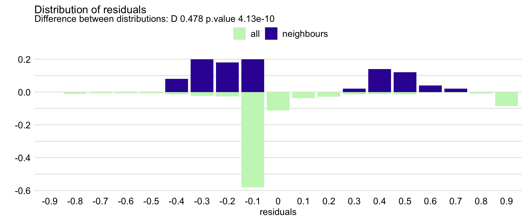
Figure 12.4: The local-fidelity plot for the random forest model for the Titanic data and passenger Henry with 100 neighbours.
Function predict_diagnostics() can be also used to construct local-stability plots. Toward this aim, we have got to select the explanatory variable, for which we want to create the plot. We can do it by passing the name of the variable to the variables argument of the function. In the code below, we first calculate CP profiles and residuals for age and 10 neighbours of Henry.
id_rf_age <- predict_diagnostics(explainer = explain_rf,
                           new_observation = henry,
                                neighbours = 10,
                                 variables = "age")
By applying the plot() function to the resulting object, we obtain the local-stability plot shown in Figure 12.5. The profiles are relatively close to each other, suggesting the stability of predictions. There are more negative than positive residuals, which may be seen as a signal of a (local) positive bias of the predictions.
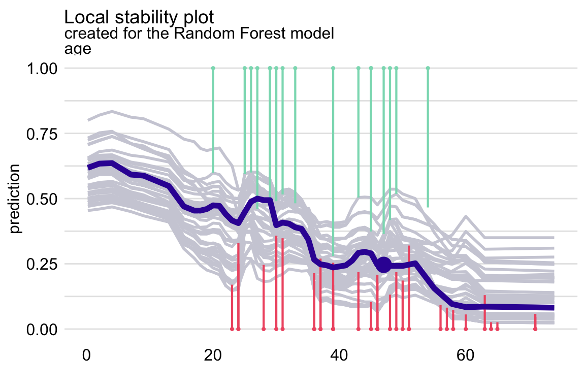
Figure 12.5: The local-stability plot for variable age in the random forest model for the Titanic data and passenger Henry with 10 neighbours. Note that some profiles overlap, so the graph shows fewer lines.
In the code below, we conduct the necessary calculations for the categorical variable class and 10 neighbours of Henry.
id_rf_class <- predict_diagnostics(explainer = explain_rf,
                             new_observation = henry,
                                  neighbours = 10,
                                   variables = "class")
By applying the plot() function to the resulting object, we obtain the local-stability plot shown in Figure ??. The profiles are not parallel, indicating non-additivity of the effect. However, they are relatively close to each other, suggesting the stability of predictions.
12.7 Code snippets for Python
At this point we are not aware of any Python libraries that would implement the methods presented in the current chapter.
References
Breiman, Leo. 2001a. “Random Forests.” Machine Learning 45: 5–32. https://doi.org/10.1023/a:1010933404324.