6 Break-down Plots for Additive Attributions
6.1 Introduction
Probably the most commonly asked question when trying to understand a model’s prediction for a single observation is: which variables contribute to this result the most? There is no single best approach that can be used to answer this question. In this chapter, we introduce break-down (BD) plots, which offer a possible solution. The plots can be used to present “variable attributions”, i.e., the decomposition of the model’s prediction into contributions that can be attributed to different explanatory variables. Note that the method is similar to the EXPLAIN algorithm introduced by Robnik-Šikonja and Kononenko (2008) and implemented in the ExplainPrediction package (Robnik-Šikonja 2018).
6.2 Intuition
As mentioned in Section 2.5, we assume that prediction \(f(\underline{x})\) is an approximation of the expected value of the dependent variable \(Y\) given values of explanatory variables \(\underline{x}\). The underlying idea of BD plots is to capture the contribution of an explanatory variable to the model’s prediction by computing the shift in the expected value of \(Y\), while fixing the values of other variables.
This idea is illustrated in Figure 6.1. Consider an example related to the prediction obtained for the random forest model model_rf for the Titanic data (see Section 4.2.2). We are interested in the probability of survival for Johnny D, an 8-year-old passenger travelling in the first class (see Section 4.2.5). Panel A of Figure 6.1 shows the distribution of the model’s predictions for observations from the Titanic dataset. In particular, the violin plot in the row marked “all data” summarizes the distribution of predictions for all 2207 observations from the dataset. The red dot indicates the mean value that can be interpreted as an estimate of the expected value of the model’s predictions over the distribution of all explanatory variables. In this example, the mean value is equal to 23.5%.
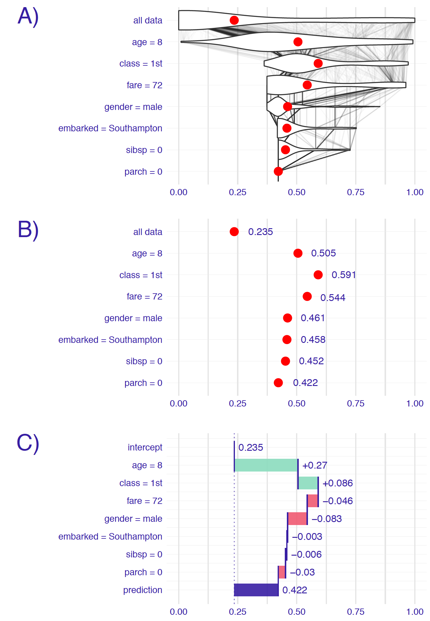
Figure 6.1: Break-down plots show how the contributions attributed to individual explanatory variables change the mean model’s prediction to yield the actual prediction for a particular single instance (observation). Panel A) The first row shows the distribution and the mean value (red dot) of the model’s predictions for all data. The next rows show the distribution and the mean value of the predictions when fixing values of subsequent explanatory variables. The last row shows the prediction for the particular instance of interest. B) Red dots indicate the mean predictions from panel A. C) The green and red bars indicate, respectively, positive and negative changes in the mean predictions (contributions attributed to explanatory variables).
To evaluate the contribution of individual explanatory variables to this particular single-instance prediction, we investigate the changes in the model’s predictions when fixing the values of consecutive variables. For instance, the violin plot in the row marked “age=8” in panel A of Figure 6.1 summarizes the distribution of the predictions obtained when the age variable takes the value “8 years”, as for Johnny D. Again, the red dot indicates the mean of the predictions, and it can be interpreted as an estimate of the expected value of the predictions over the distribution of all explanatory variables other than age. The violin plot in the “class=1st” row describes the distribution and the mean value of predictions with the values of variables age and class set to “8 years” and “1st class”, respectively. Subsequent rows contain similar information for other explanatory variables included in the random forest model. In the last row, all explanatory variables are fixed at the values describing Johnny D. Hence, the last row contains only one point, the red dot, which corresponds to the model’s prediction, i.e., survival probability, for Johnny D.
The thin grey lines in panel A of Figure 6.1 show the change of predictions for different individuals when the value of a particular explanatory variable is being replaced by the value indicated in the name of the row. For instance, the lines between the first and the second row indicate that fixing the value of the age variable to “8 years” has a different effect for different individuals. For some individuals (most likely, passengers that are 8 years old) the model’s prediction does not change at all. For others, the predicted value increases (probably for the passengers older than 8 years) or decreases (most likely for the passengers younger than 8 years).
Eventually, however, we may be interested in the mean predictions, or even only in the changes of the means. Thus, simplified plots, similar to those shown in panels B and C of Figure 6.1, may be of interest. Note that, in panel C, the row marked “intercept” presents the overall mean value (0.235) of predictions for the entire dataset. Consecutive rows present changes in the mean prediction induced by fixing the value of a particular explanatory variable. Positive changes are indicated with green bars, while negative differences are indicated with red bars. The last row, marked “prediction,” contains the sum of the overall mean value and the changes, i.e., the predicted value of survival probability for Johnny D, indicated by the blue bar.
What can be learned from BD plots as those presented in Figure 6.1? The plots offer a summary of the effects of particular explanatory variables on a model’s predictions.
From Figure 6.1 we can conclude, for instance, that the mean prediction for the random forest model for the Titanic dataset is equal to 23.5%. This is the predicted probability of survival averaged over all people on Titanic. Note that it is not the percentage of individuals that survived, but the mean model-prediction. Thus, for a different model, we would most likely obtain a different mean value.
The model’s prediction for Johnny D is equal to 42.2%. It is much higher than the mean prediction. The two explanatory variables that influence this prediction the most are class (with the value “1st”) and age (with the value equal to 8). By fixing the values of these two variables, we add 35.6 percentage points to the mean prediction. All other explanatory variables have smaller effects, and they actually reduce the increase in the predicted value induced by class and age. For instance, gender (Johnny D was a boy) reduces the predicted survival probability by about 8.3 percentage points.
It is worth noting that the part of the prediction attributed to an explanatory variable depends not only on the variable but also on the considered value. For instance, in the example presented in Figure 6.1, the effect of the embarked harbour is very small. This may be due to the fact that the variable is not very important for prediction. However, it is also possible that the variable is important, but the effect of the value considered for the particular instance (Johnny D, who embarked Titanic in Southampton) may be close to the mean, as compared to all other possible values of the variable.
It is also worth mentioning that, for models that include interactions, the part of the prediction attributed to a variable depends on the order in which one sets the values of the explanatory variables. Note that the interactions do not have to be explicitly specified in the model structure as it is the case of, for instance, linear-regression models. They may also emerge as a result of fitting to the data a flexible model like, for instance, a regression tree.
To illustrate the point, Figure 6.2 presents an example of a random forest model with only three explanatory variables fitted to the Titanic data. Subsequently, we focus on the model’s prediction for a 2-year old boy that travelled in the second class. The predicted probability of survival is equal to 0.964, more than a double of the mean model-prediction of 0.407. We would like to understand which explanatory variables drive this prediction. Two possible explanations are illustrated in Figure 6.2.
Explanation 1:
We first consider the explanatory variables gender, class, and age, in that order. Figure 6.2 indicates negative contributions for the first two variables and a positive contribution for the third one. Thus, the fact that the passenger was a boy decreases the chances of survival, as compared to the mean model-prediction. He travelled in the second class, which further lowers the probability of survival. However, as the boy was very young, this substantially increases the odds of surviving. This last conclusion is the result of the fact that most passengers in the second class were adults; therefore, a kid from the second class had higher chances of survival.
Explanation 2:
We now consider the following order of explanatory variables: gender, age, and class. Figure 6.2 indicates a positive contribution of class, unlike in the first explanation. Again, the fact that the passenger was a boy decreases the chances of survival, as compared to the mean model-prediction. However, he was very young, and this increases the probability of survival as compared to adult men. Finally, the fact that the boy travelled in the second class increases the chance even further. This last conclusion stems from the fact that most kids travelled in the third class; thus, being a child in the second class would increase chances of survival.
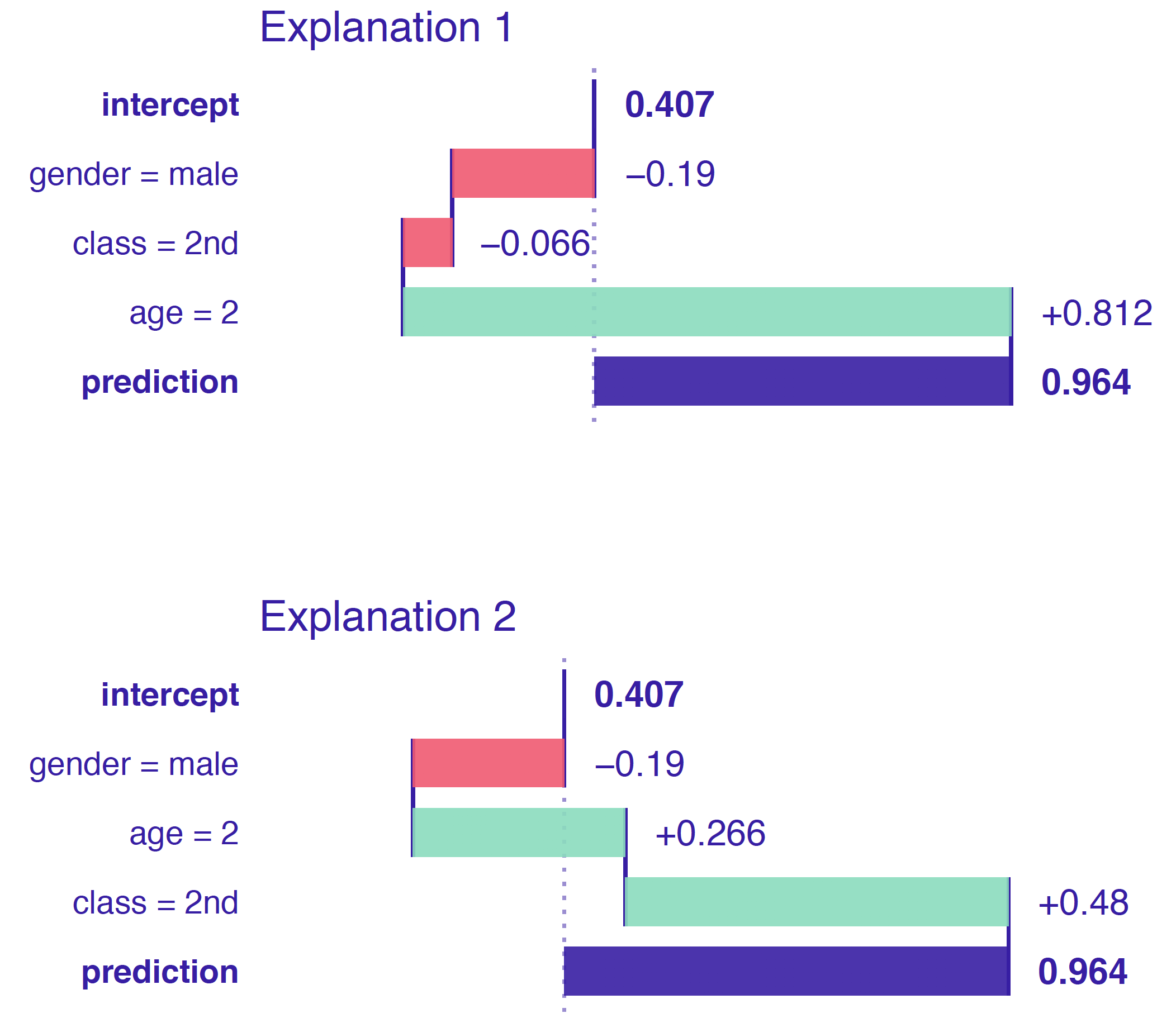
Figure 6.2: An illustration of the order-dependence of variable attributions. Two break-down plots for the same observation for a random forest model for the Titanic dataset. The contribution attributed to class is negative in the plot at the top and positive in the one at the bottom. The difference is due to the difference in the ordering of explanatory variables used to construct the plots (as seen in the labelling of the rows).
6.3 Method
In this section, we introduce more formally the method of variable attribution. We first focus on linear models, because their simple and additive structure allows building intuition. Then we consider a more general case.
6.3.1 Break-down for linear models
Assume the classical linear-regression model for dependent variable \(Y\) with \(p\) explanatory variables, the values of which are collected in vector \(\underline{x}\), and vector \(\underline{\beta}\) of \(p\) corresponding coefficients. Note that we separately consider \(\beta^0\), which is the intercept. Prediction for \(Y\) is given by the expected value of \(Y\) conditional on \(\underline{x}\). In particular, the expected value is given by the following linear combination:
\[\begin{equation} E_Y(Y | \underline{x}) = f(\underline{x}) = \beta^0 + \underline{x}'\underline{\beta}. \tag{6.1} \end{equation}\]
Assume that we select a vector of values of explanatory variables \(\underline{x}_* \in \mathcal R^p\). We are interested in the contribution of the \(j\)-th explanatory variable to model’s prediction \(f(\underline{x}_*)\) for a single observation described by \(\underline{x}_*\).
A possible approach to evaluate the contribution is to measure how much the expected value of \(Y\) changes after conditioning on \({x}^j_*\). Using the notation \(\underline{x}^{j|=X^j}_*\) (see Section 2.3) to indicate that we treat the value of the \(j\)-th coordinate as a random variable \(X^j\), we can thus define
\[\begin{equation} v(j, \underline{x}_*) = E_Y(Y | \underline{x}_*) - E_{X^j}\left[E_Y\left\{Y | \underline{x}^{j|=X^j}_*\right\}\right]= f(\underline{x}_*) - E_{X^j}\left\{f\left(\underline{x}^{j|=X^j}_*\right)\right\}, \tag{6.2} \end{equation}\]
where \(v(j, \underline{x}_*)\) is the variable-importance measure for the \(j\)-th explanatory variable evaluated at \(\underline{x}_*\) and the last expected value on the right-hand side of (6.2) is taken over the distribution of the variable (treated as random). For the linear-regression model (6.1), and if the explanatory variables are independent, \(v(j,\underline{x}_*)\) can be expressed as follows:
\[\begin{equation} v(j, \underline{x}_*) = \beta^0 + \underline{x}_*' \underline{\beta} - E_{X^j}\left\{\beta^0 + \left(\underline{x}^{j|=X^j}_*\right)' \underline{\beta}\right\} = {\beta}^j\left\{{x}_*^j - E_{X^j}(X^j)\right\}. \tag{6.3} \end{equation}\]
Using (6.3), the linear-regression prediction (6.1) may be re-expressed in the following way:
\[\begin{align} f(\underline{x}_*) &= \left\{\beta^0 + {\beta}^1E_{X^1}(X^1) + ... + {\beta}^pE_{X^p}(X^p)\right\}+ \nonumber \\ & \ \ \ \left[\left\{{x}^1_* - E_{X^1}(X^1)\right\} {\beta}^1 + ... +\left\{{x}^p_* - E_{X^p}(X^p)\right\} {\beta}^p\right] \nonumber \\ &\equiv (mean \ prediction) + \sum_{j=1}^p v(j, \underline{x}_*). \tag{6.4} \end{align}\]
Thus, the contributions of the explanatory variables \(v(j, \underline{x}_*)\) sum up to the difference between the model’s prediction for \(\underline{x}_*\) and the mean prediction.
In practice, given a dataset, the expected value \(E_{X^j}(X^j)\) can be estimated by the sample mean \(\bar x^j\). This leads to
\[\begin{equation} {v}(j, \underline{x}_*) = {\beta}^j ({x}_*^j - \bar x^j). \end{equation}\]
Obviously, the sample mean \(\bar x^j\) is an estimator of the expected value \(E_{X^j}(X^j)\), calculated using a dataset. For the sake of simplicity, we do not emphasize this difference in the notation. Also, we ignore the fact that, in practice, we never know the true model coefficients and use their estimates instead. We are also silent about the fact that, usually, explanatory variables are not independent. We needed this simplified example just to build our intuition.
6.3.2 Break-down for a general case
Again, let \(v(j, \underline{x}_*)\) denote the variable-importance measure of the \(j\)-th variable and instance \(\underline{x}_*\), i.e., the contribution of the \(j\)-th variable to the model’s prediction at \(\underline{x}_*\).
We would like the sum of the \(v(j, \underline{x}_*)\) for all explanatory variables to be equal to the instance prediction. This property is called local accuracy. Thus, we want that
\[\begin{equation} f(\underline{x}_*) = v_0 + \sum_{j=1}^p v(j, \underline{x}_*), \tag{6.5} \end{equation}\]
where \(v_0\) denotes the mean model-prediction. Denote by \(\underline{X}\) the vector of random values of explanatory variables. If we rewrite equation (6.5) as follows:
\[\begin{equation} E_{\underline{X}}\{f(\underline{X})|X^1 = {x}^1_*, \ldots, X^p = {x}^p_*\} = E_{\underline{X}}\{f(\underline{X})\} + \sum_{j=1}^p v(j, \underline{x}_*), \end{equation}\]
then a natural proposal for \(v(j, \underline{x}_*)\) is
\[\begin{align} v(j, \underline{x}_*) =& E_{\underline{X}}\{f(\underline{X}) | X^1 = {x}^1_*, \ldots, X^j = {x}^j_*\} - \nonumber \\ & E_{\underline{X}}\{f(\underline{X}) | X^1 = {x}^1_*, \ldots, X^{j-1} = {x}^{j-1}_*\}. \tag{6.6} \end{align}\]
In other words, the contribution of the \(j\)-th variable is the difference between the expected value of the model’s prediction conditional on setting the values of the first \(j\) variables equal to their values in \(\underline{x}_*\) and the expected value conditional on setting the values of the first \(j-1\) variables equal to their values in \(\underline{x}_*\).
Note that the definition does imply the dependence of \(v(j, \underline{x}_*)\) on the order of the explanatory variables that is reflected in their indices (superscripts).
To consider more general cases, let \(J\) denote a subset of \(K\) indices (\(K\leq p\)) from \(\{1,2,\ldots,p\}\), i.e., \(J=\{j_1,j_2,\ldots,j_K\}\), where each \(j_k \in \{1,2,\ldots,p\}\). Furthermore, let \(L\) denote another subset of \(M\) indices (\(M\leq p-K\)) from \(\{1,2,\ldots,p\}\), distinct from \(J\). That is, \(L=\{l_1,l_2,\ldots,l_M\}\), where each \(l_m \in \{1,2,\ldots,p\}\) and \(J \cap L = \emptyset\). Let us define now
\[\begin{align} \Delta^{L|J}(\underline{x}_*) \equiv & E_{\underline{X}}\{f(\underline{X}) | X^{l_1} = {x}_*^{l_1},\ldots,X^{l_M} = {x}_*^{l_M},X^{j_1} = {x}_*^{j_1},\ldots,X^{j_K} = {x}_*^{j_K}\} - \nonumber \\ & E_{\underline{X}}\{f(\underline{X}) | X^{j_1} = {x}_*^{j_1},\ldots,X^{j_K} = {x}_*^{j_K}\}. \end{align}\]
In other words, \(\Delta^{L|J}(\underline{x}_*)\) is the change between the expected model-prediction, when setting the values of the explanatory variables with indices from the set \(J \cup L\) equal to their values in \(\underline{x}_*\), and the expected prediction conditional on setting the values of the explanatory variables with indices from the set \(J\) equal to their values in \(\underline{x}_*\).
In particular, for the \(l\)-th explanatory variable, let
\[\begin{align} \Delta^{l|J}(\underline{x}_*) \equiv \Delta^{\{l\}|J}(\underline{x}_*) = & E_{\underline{X}}\{f(\underline{X}) | X^{j_1} = {x}_*^{j_1},\ldots,X^{j_K} = {x}_*^{j_K}, X^{l} = {x}_*^{l}\} - \nonumber \\ & E_{\underline{X}}\{f(\underline{X}) | X^{j_1} = {x}_*^{j_1},\ldots,X^{j_K} = {x}_*^{j_K}\}. \tag{6.7} \end{align}\]
Thus, \(\Delta^{l|J}\) is the change between the expected prediction, when setting the values of the explanatory variables with indices from the set \(J \cup \{l\}\) equal to their values in \(\underline{x}_*\), and the expected prediction conditional on setting the values of the explanatory variables with indices from the set \(J\) equal to their values in \(\underline{x}_*\). Note that, if \(J=\emptyset\), then
\[\begin{equation} \Delta^{l|\emptyset}(\underline{x}_*) = E_{\underline{X}}\{f(\underline{X}) | X^{l} = {x}_*^{l}\} - E_{\underline{X}}\{f(\underline{X})\} = E_{\underline{X}}\{f(\underline{X}) | X^{l} = {x}_*^{l}\} - v_0. \tag{6.8} \end{equation}\]
It follows that
\[\begin{equation} v(j, \underline{x}_*) = \Delta^{j|\{1,\ldots, j-1\}}(\underline{x}_*) = \Delta^{\{1,\ldots, j\}|\emptyset}(\underline{x}_*)-\Delta^{\{1,\ldots, j-1\}|\emptyset}(\underline{x}_*). \tag{6.9} \end{equation}\]
As it was mentioned in Section 6.2, for models that include interactions, the value of the variable-importance measure \(v(j, \underline{x}_*)\) depends on the order of conditioning on explanatory variables. A heuristic approach to address this issue consists of choosing an order in which the variables with the largest contributions are selected first. In particular, the following two-step procedure can be considered. In the first step, the ordering is chosen based on the decreasing values of \(|\Delta^{k|\emptyset}(\underline{x}_*)|\). Note that the use of absolute values is needed because the variable contributions can be positive or negative. In the second step, the variable-importance measure for the \(j\)-th variable is calculated as \[ v(j, \underline{x}_*) = \Delta ^{j|J}(\underline{x}_*), \] where \[ J = \{k: |\Delta^{k|\emptyset}(\underline{x}_*)| < |\Delta^{j|\emptyset}(\underline{x}_*)|\}. \] That is, \(J\) is the set of indices of explanatory variables with scores \(|\Delta^{k|\emptyset}(\underline{x}_*)|\) smaller than the corresponding score for variable \(j\).
The time complexity of each of the two steps of the procedure is \(O(p)\), where \(p\) is the number of explanatory variables.
Note, that there are also other possible approaches to the problem of calculation of variable attributions. One consists of identifying the interactions that cause a difference in variable-importance measures for different orderings and focusing on those interactions. This approach is discussed in Chapter 7. The other one consists of calculating an average value of the variance-importance measure across all possible orderings. This approach is presented in Chapter 8.
6.4 Example: Titanic data
Let us consider the random forest model titanic_rf (see Section 4.2.2) and passenger Johnny D (see Section 4.2.5) as the instance of interest in the Titanic data.
The mean of model’s predictions for all passengers is equal to \(v_0=\) 0.2353095. Table 6.1 presents the scores \(|\Delta^{j|\emptyset}(\underline{x}_*)|\) and the expected values \(E_{\underline{X}}\{f(\underline{X}) | X^j = {x}^j_*\}\). Note that, given (6.8) and the fact that \(E_{\underline{X}}\{f(\underline{X}) | X^j = {x}^j_*\}>v_0\) for all variables, we have got \(E_{\underline{X}}\{f(\underline{X}) | X^j = {x}^j_*\}=|\Delta^{j|\emptyset}(\underline{x}_*)|+v_0\).
| variable \(j\) | \(E_{\underline{X}}\{f(\underline{X}) | X^j = {x}^j_*\}\) | \(|\Delta^{j|\emptyset}(\underline{x}_*)|\) |
|---|---|---|
| age = 8 | 0.5051210 | 0.2698115 |
| class = 1st | 0.4204449 | 0.1851354 |
| fare = 72 | 0.3785383 | 0.1432288 |
| gender = male | 0.1102873 | 0.1250222 |
| embarked = Southampton | 0.2246035 | 0.0107060 |
| sibsp = 0 | 0.2429597 | 0.0076502 |
| parch = 0 | 0.2322655 | 0.0030440 |
Based on the ordering defined by the scores \(|\Delta^{j|\emptyset}(\underline{x}_*)|\) from Table 6.1, we can compute the variable-importance measures based on the sequential contributions \(\Delta^{j|J}(\underline{x}_*)\). The computed values are presented in Table 6.2.
| variable \(j\) | \(E_{\underline{X}}\left\{ f(\underline{X}) | \underline{X}^{J} = \underline{x}^{J}_*\right\}\) | \(\Delta^{j|J}(\underline{x}_*)\) |
|---|---|---|
| intercept \((v_0)\) | 0.2353095 | 0.2353095 |
| age = 8 | 0.5051210 | 0.2698115 |
| class = 1st | 0.5906969 | 0.0855759 |
| fare = 72 | 0.5443561 | -0.0463407 |
| gender = male | 0.4611518 | -0.0832043 |
| embarked = Southampton | 0.4584422 | -0.0027096 |
| sibsp = 0 | 0.4523398 | -0.0061024 |
| parch = 0 | 0.4220000 | -0.0303398 |
| prediction | 0.4220000 | 0.4220000 |
Results from Table 6.2 are presented in Figure 6.3. The plot indicates that the largest positive contributions to the predicted probability of survival for Johnny D come from explanatory variables age and class. The contributions of the remaining variables are smaller (in absolute values) and negative.
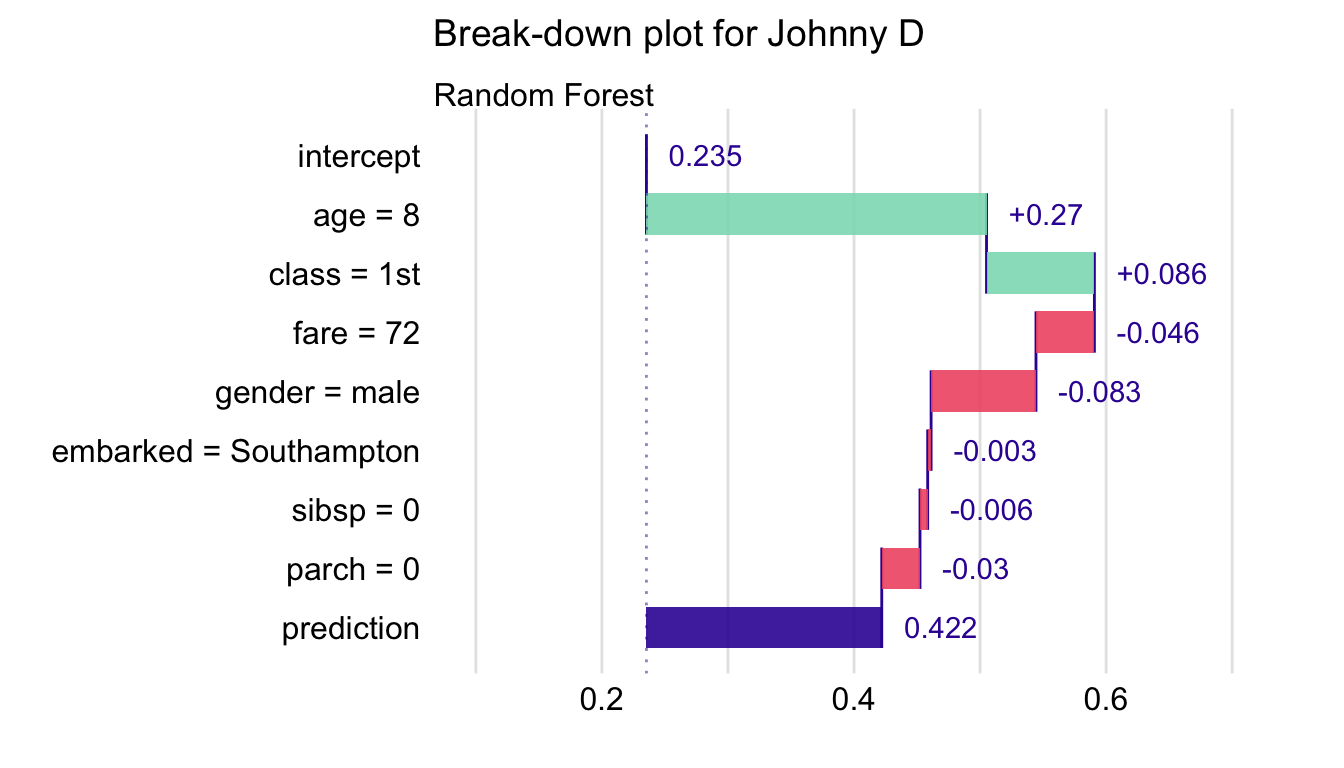
Figure 6.3: Break-down plot for the random forest model and Johnny D for the Titanic data.
6.5 Pros and cons
BD plots offer a model-agnostic approach that can be applied to any predictive model that returns a single number for a single observation (instance). The approach offers several advantages. The plots are, in general, easy to understand. They are compact; results for many explanatory variables can be presented in a limited space. The approach reduces to an intuitive interpretation for linear models. Numerical complexity of the BD algorithm is linear in the number of explanatory variables.
An important issue is that BD plots may be misleading for models including interactions. This is because the plots show only the additive attributions. Thus, the choice of the ordering of the explanatory variables that is used in the calculation of the variable-importance measures is important. Also, for models with a large number of variables, BD plots may be complex and include many explanatory variables with small contributions to the instance prediction.
To address the issue of the dependence of the variable-importance measure on the ordering of the explanatory variables, the heuristic approach described in Section 6.3.2 can be applied. Alternative approaches are described in Chapters 7 and 8.
6.6 Code snippets for R
In this section, we use the DALEX package, which is a wrapper for the iBreakDown R package (Gosiewska and Biecek 2019). The package covers all methods presented in this chapter. It is available on CRAN and GitHub.
For illustration purposes, we use the titanic_rf random forest model for the Titanic data developed in Section 4.2.2. Recall that the model is developed to predict the probability of survival for passengers of Titanic. Instance-level explanations are calculated for Henry, a 47-year-old passenger that travelled in the 1st class (see Section 4.2.5).
We first retrieve the titanic_rf model-object and the data frame for Henry via the archivist hooks, as listed in Section 4.2.7. We also retrieve the version of the titanic data with imputed missing values.
titanic_imputed <- archivist::aread("pbiecek/models/27e5c")
titanic_rf <- archivist:: aread("pbiecek/models/4e0fc")
(henry <- archivist::aread("pbiecek/models/a6538"))
## class gender age sibsp parch fare embarked
## 1 1st male 47 0 0 25 CherbourgThen we construct the explainer for the model by using function explain() from the DALEX package (see Section 4.2.6). We also load the randomForest package, as the model was fitted by using function randomForest() from this package (see Section 4.2.2) and it is important to have the corresponding predict() function available.
library("randomForest")
library("DALEX")
explain_rf <- DALEX::explain(model = titanic_rf,
                        data = titanic_imputed[, -9],
                           y = titanic_imputed$survived == "yes",
                       label = "Random Forest")
The explainer object allows uniform access to predictive models regardless of their internal structure. With this object, we can proceed to the model analysis.
6.6.1 Basic use of the predict_parts() function
The DALEX::predict_parts() function decomposes model predictions into parts that can be attributed to individual variables. It calculates the variable-attribution measures for a selected model and an instance of interest. The object obtained as a result of applying the function is a data frame containing the calculated measures.
In the simplest call, the function requires three arguments:
explainer- an explainer-object, created with functionDALEX::explain();new_observation- an observation to be explained; it should be a data frame with a structure that matches the structure of the dataset used for fitting of the model;type- the method for calculation of variable attribution; the possible methods are"break_down"(the default),"shap","oscillations", and"break_down_interactions".
In the code below, the argument type = "break_down" is explicitly used. The code essentially provides the variable-importance values \(\Delta^{j|\{1,\ldots,j\}}(\underline{x}_*)\).
##                                     contribution
## Random Forest: intercept                   0.235
## Random Forest: class = 1st                 0.185
## Random Forest: gender = male              -0.124
## Random Forest: embarked = Cherbourg        0.105
## Random Forest: age = 47                   -0.092
## Random Forest: fare = 25                  -0.030
## Random Forest: sibsp = 0                  -0.032
## Random Forest: parch = 0                  -0.001
## Random Forest: prediction                  0.246
By applying the generic plot() function to the object resulting from the application of the predict_parts() function we obtain a BD plot.
The resulting plot is shown in Figure 6.4. It can be used to compare the explanatory-variable attributions obtained for Henry with those computed for Johnny D (see Figure 6.3). Both explanations refer to the same random forest model. We can see that the predicted survival probability for Henry (0.246) is almost the same as the mean prediction (0.235), while the probability for Johnny D is higher (0.422). For Johnny D, this result can be mainly attributed to the positive contribution of age and class. For Henry, class still contributes positively to the chances of survival, but the effect of age is negative. For both passengers the effect of gender is negative. Thus, one could conclude that the difference in the predicted survival probabilities is mainly due to the difference in the age of Henry and Johnny D.
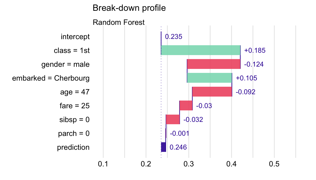
Figure 6.4: Break-down plot for the random forest model and Henry for the Titanic data, obtained by the generic plot() function in R.
6.6.2 Advanced use of the predict_parts() function
Apart from the explainer, new_observation, and type arguments, function predict_parts() allows additional ones. The most commonly used are:
order- a vector of characters (column names) or integers (column indexes) that specify the order of explanatory variables to be used for computing the variable-importance measures; if not specified (default), then a one-step heuristic is used to determine the order;keep_distributions- a logical value (FALSEby default); ifTRUE, then additional diagnostic information about conditional distributions of predictions is stored in the resulting object and can be plotted with the genericplot()function.
In what follows, we illustrate the use of the arguments.
First, we specify the ordering of the explanatory variables. Toward this end, we can use integer indexes or variable names. The latter option is preferable in most cases because of transparency. Additionally, to reduce clutter in the plot, we set max_features = 3 argument in the plot() function.
bd_rf_order <- predict_parts(explainer = explain_rf,
                       new_observation = henry,
                                  type = "break_down",
                   order = c("class", "age", "gender", "fare",
                             "parch", "sibsp", "embarked"))
plot(bd_rf_order, max_features = 3)
The resulting plot is presented in Figure 6.5. It is worth noting that the attributions for variables gender and fare do differ from those shown in Figure 6.4. This is the result of the change of the ordering of variables used in the computation of the attributions.
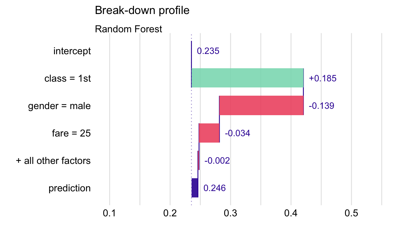
Figure 6.5: Break-down plot for the top three variables for the random forest model and Henry for the Titanic data.
We can use the keep_distributions = TRUE argument to enrich the resulting object with additional information about conditional distributions of predicted values. Subsequently, we can apply the plot_distributions = TRUE argument in the plot() function to present the distributions as violin plots.
bd_rf_distr <- predict_parts(explainer = explain_rf,
                       new_observation = henry,
                                  type = "break_down",
              order = c("age", "class", "fare", "gender",
                        "embarked", "sibsp", "parch"),
                    keep_distributions = TRUE)
plot(bd_rf_distr, plot_distributions = TRUE)
The resulting plot is presented in Figure 6.6. Red dots indicate the mean model’s predictions. Thin grey lines between violin plots indicate changes in predictions for individual observations. They can be used to track how the model’s predictions change after consecutive conditionings. A similar code was used to create the plot in panel A of Figure 6.1 for Johnny D.
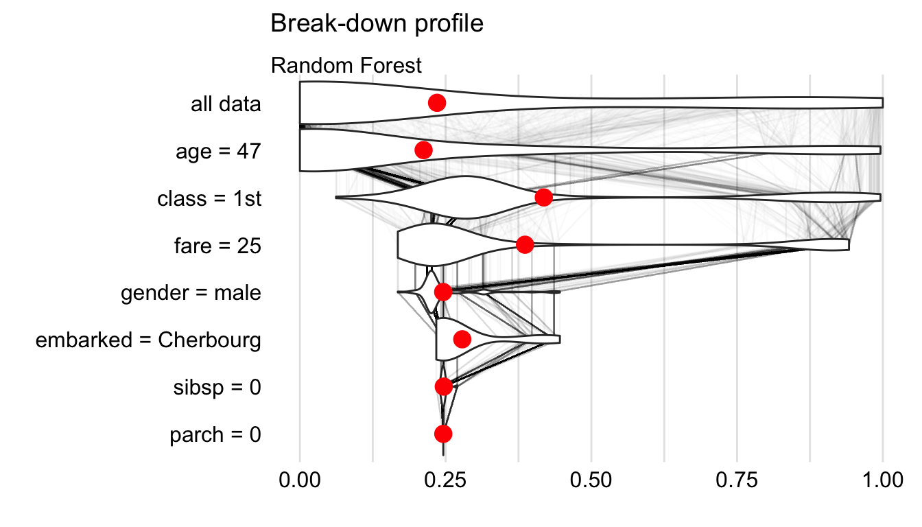
Figure 6.6: Break-down plot with violin plots summarizing distributions of predicted values for a selected order of explanatory variables for the random forest model and Henry for the Titanic data.
6.7 Code snippets for Python
In this section, we use the dalex library in Python. The package covers all methods presented in this chapter. It is available on pip and GitHub.
For illustration purposes, we use the titanic_rf random forest model for the Titanic data developed in Section 4.3.2. Recall that the model is developed to predict the probability of survival for passengers of Titanic. Instance-level explanations are calculated for Henry, a 47-year-old passenger that travelled in the first class (see Section 4.3.5).
In the first step, we create an explainer object that will provide a uniform interface for the predictive model. We use the Explainer() constructor for this purpose (see Section 4.3.6).
import pandas as pd
henry = pd.DataFrame({'gender'   : ['male'],
                       'age'     : [47],
                       'class'   : ['1st'],
                       'embarked': ['Cherbourg'],
                       'fare'    : [25],
                       'sibsp'   : [0],
                       'parch'   : [0]},
                      index = ['Henry'])

import dalex as dx
titanic_rf_exp = dx.Explainer(titanic_rf, X, y,
                  label = "Titanic RF Pipeline")
To apply the break-down method we use the predict_parts() method. The first argument indicates the data for the observation for which the attributions are to be calculated. The type argument specifies the method of calculation of attributions. Results are stored in the result field.
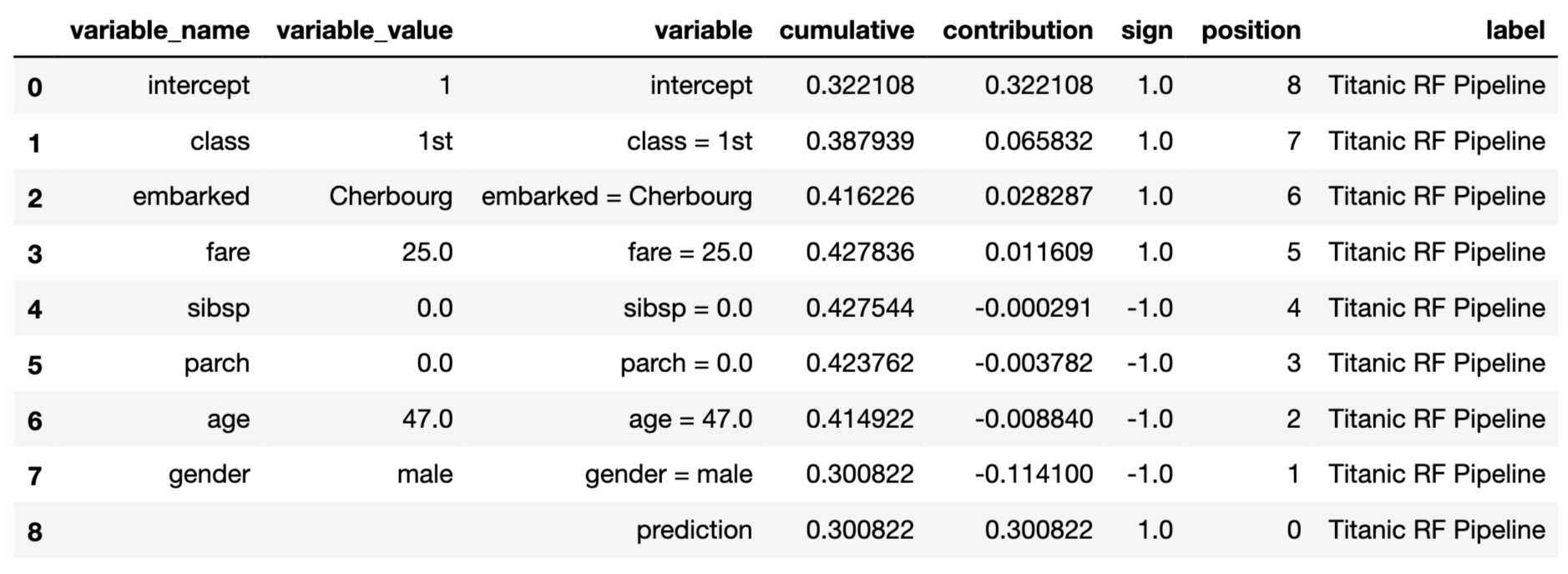
To obtain a waterfall chart we can use the plot() method. It generates an interactive chart based on the plotly library.
The resulting plot is presented in Figure 6.7.
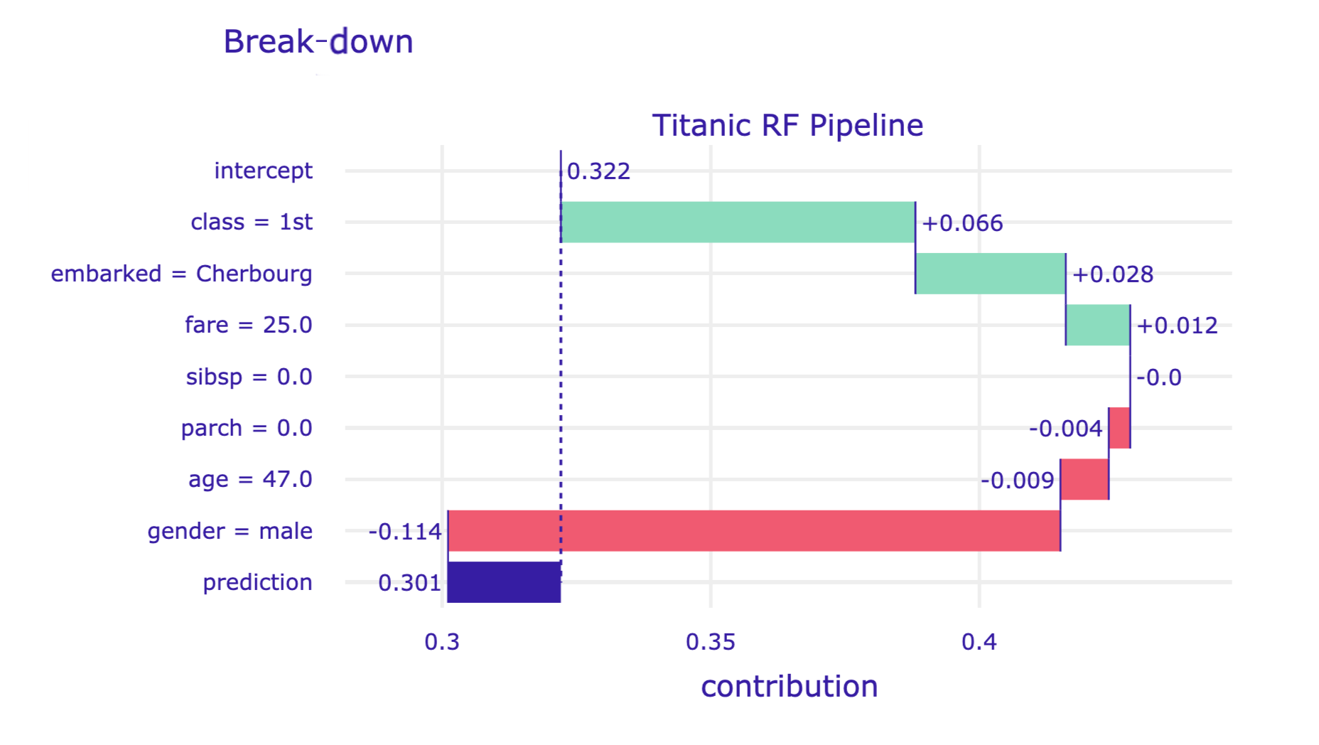
Figure 6.7: Break-down plot for the random forest model and Henry for the Titanic data, obtained by the plot() method in Python.
Advanced users can make use of the order argument of the predict_parts() method. It allows forcing a specific order of variables in the break-down method. Also, if the model includes many explanatory variables, the waterfall chart may be hard to read. In this situation, the max_vars argument can be used in the plot() method to limit the number of variables presented in the graph.
import numpy as np

bd_henry = titanic_rf_exp.predict_parts(henry,
        type = 'break_down',
        order = np.array(['gender', 'class', 'age',
            'embarked', 'fare', 'sibsp', 'parch']))
bd_henry.plot(max_vars = 5)
The resulting plot is presented in Figure 6.8.
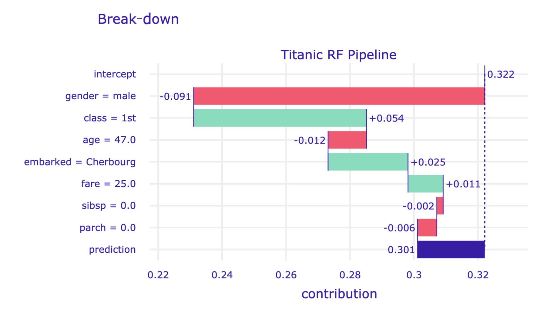
Figure 6.8: Break-down plot for a limited number of explanatory variables in a specified order for the random forest model and Henry for the Titanic data, obtained by the plot() method in Python.
References
Gosiewska, Alicja, and Przemyslaw Biecek. 2019. iBreakDown: Uncertainty of Model Explanations for Non-additive Predictive Models. https://arxiv.org/abs/1903.11420v1.
Robnik-Šikonja, Marco, and Igor Kononenko. 2008. “Explaining Classifications for Individual Instances.” IEEE Transactions on Knowledge and Data Engineering 20 (5): 589–600. https://doi.org/10.1109/tkde.2007.190734.
Robnik-Šikonja, Marko. 2018. ExplainPrediction: Explanation of Predictions for Classification and Regression Models. https://CRAN.R-project.org/package=ExplainPrediction.